Images should be simple with one central theme and little clutter. Remember too that text will be added - most often on top or bottom, and to the right of the main image. Text adds to the interest in a photograph and often the combination takes on a wholly different mood.
I spent an hour in the studio with some kitchen objects. Cutlery, knives, a mortar and pestle and other random objects. I used a plane background as I planned to use the images as a starting point for later manipulations at edit time.
It can be difficult to spot the potential in an original shot. I enjoy edit time as sometimes there is a pleasant surprise waiting when a simple photograph with little going for it is transformed into a saleable image.
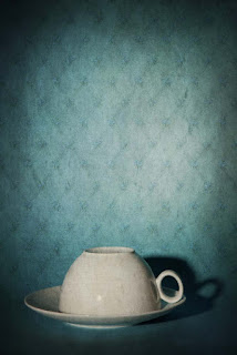
This simple shot of an upside down coffee cup on a blue background caught my eye. I liked the way the shadow behind the handle made the white oval stand out and created some atmosphere. Shadows are so useful!
 I experimented with some textures on the image, going for an isolated or mystery look. I have found that light blue backgrounds give the best base for a texture, even when the final colour might be something completely different.
This texture, produced from a photograph of 1950s wallpaper was overlaid in Photoshop with 50% opacity in overlay blend mode. I applied a vingnette to give more atmosphere and I was happy with the result. The image is in the Getty Images Open Collection.
It sold to an Italian theatre company for promotional material and became the theme for the production.
Image available on Getty Images


No comments:
Post a Comment