Self publishers aside, the process for the publisher in designing a book cover may be in-house or contracted to a specialist book designer.
The final design may not use a photograph of course, and I am not here to about graphic art.
The designer will often read the book to get a feel for the cover which will hit the correct note. Then a number of roughs will be made, and the design discussed with the publisher, marketing teams and maybe the author and literary agent. If a photograph is being used, the designer will usually request a test copy of the image from the image agent. They are free to use the image as they see fit, often overlaying more than one image to reach the final design.
Here is a nice 5 minute YouTube clip from Random House about the design process.
https://www.youtube.com/watch?v=l2Z86L25v30
Once the final cover is chosen, if your photograph has been used your agent will negotiate the fee. The deal will depend on factors such as sales area, number of copies to be published, exclusivity etc. America is the largest market attracting the highest fees.
You then just have to sit back and wait for the print run and eventual payment which can take months.
Monday, 28 December 2015
Friday, 25 December 2015
The last hole
I drive past Styal golf course every day. One late afternoon in April the sun was just above the horizon and the shadows were long. I thought there must be a photograph there. I stopped the car and climbed over the fence onto the green. I think it is the 9th. hole. It was late on and there were no golfers about.
I took a few shots and was happy enough with this one without much manipulation: I think I applied a darkened graduation each side of the flag to produce a gutter of light and I had to photoshop out the golf course logo on the flag.
Here a Polish publisher has used it for an Agatha Christie book cover. Maybe the shot was destined for the cover of a book called Murder on the Links. The original image is square, and the flag pole is awkwardly placed to allow text and the designer has used a graduated black overlay to make extra room for the title
I took a few shots and was happy enough with this one without much manipulation: I think I applied a darkened graduation each side of the flag to produce a gutter of light and I had to photoshop out the golf course logo on the flag.
The image is in the Getty Moment Collection and so far has sold 18 times worldwide for various uses.
Conceptual still life
Human interest is tops of course - more book covers have people on them than not, most often with back to camera! But still life shots are always in demand, and the more conceptual the better. The image should be atmospheric and evoke a theme such as mystery, freedom, danger, loss.
Images should be simple with one central theme and little clutter. Remember too that text will be added - most often on top or bottom, and to the right of the main image. Text adds to the interest in a photograph and often the combination takes on a wholly different mood.
I spent an hour in the studio with some kitchen objects. Cutlery, knives, a mortar and pestle and other random objects. I used a plane background as I planned to use the images as a starting point for later manipulations at edit time.
It can be difficult to spot the potential in an original shot. I enjoy edit time as sometimes there is a pleasant surprise waiting when a simple photograph with little going for it is transformed into a saleable image.
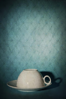
This simple shot of an upside down coffee cup on a blue background caught my eye. I liked the way the shadow behind the handle made the white oval stand out and created some atmosphere. Shadows are so useful!
 I experimented with some textures on the image, going for an isolated or mystery look. I have found that light blue backgrounds give the best base for a texture, even when the final colour might be something completely different.
This texture, produced from a photograph of 1950s wallpaper was overlaid in Photoshop with 50% opacity in overlay blend mode. I applied a vingnette to give more atmosphere and I was happy with the result. The image is in the Getty Images Open Collection.
It sold to an Italian theatre company for promotional material and became the theme for the production.
Image available on Getty Images
Images should be simple with one central theme and little clutter. Remember too that text will be added - most often on top or bottom, and to the right of the main image. Text adds to the interest in a photograph and often the combination takes on a wholly different mood.
I spent an hour in the studio with some kitchen objects. Cutlery, knives, a mortar and pestle and other random objects. I used a plane background as I planned to use the images as a starting point for later manipulations at edit time.
It can be difficult to spot the potential in an original shot. I enjoy edit time as sometimes there is a pleasant surprise waiting when a simple photograph with little going for it is transformed into a saleable image.
This simple shot of an upside down coffee cup on a blue background caught my eye. I liked the way the shadow behind the handle made the white oval stand out and created some atmosphere. Shadows are so useful!
 I experimented with some textures on the image, going for an isolated or mystery look. I have found that light blue backgrounds give the best base for a texture, even when the final colour might be something completely different.
This texture, produced from a photograph of 1950s wallpaper was overlaid in Photoshop with 50% opacity in overlay blend mode. I applied a vingnette to give more atmosphere and I was happy with the result. The image is in the Getty Images Open Collection.
It sold to an Italian theatre company for promotional material and became the theme for the production.
Image available on Getty Images
Thursday, 24 December 2015
Book cover photography
How do you take a photograph which might be attractive to a book cover designer?
There is usually a distinct look to book cover images. For a publishing house the goal is to attract readers of the genre: Romantic Fiction, Thriller, Young Adult, Literary etc. The cover need not convey any information about the story, but a mood should be created. An attractive narrative image will make the book buyer want to find out where the mystery leads. The photographer's and cover designer's job is to create the mood.
Most authors would agree, a good book cover will put up sales of a book. It's the publisher who gets the final say on the design but the author is usually consulted.
I took this photograph on a drive in the Cheshire countryside. I was not on a photo shoot, but as I passed an ironwork gate, I thought it had potential as an image. It was late afternoon in summer and the sun was low. The original image had nice elements, but the magic was applied later in Lightroom and Photoshop.
The image was cropped, then the glowing light was photoshopped in. A texture applied to give the evening look.
Original Image:
The finished image:
The textures I use are from the wonderful collections at flypapertextures.com
Subscribe to:
Comments (Atom)


